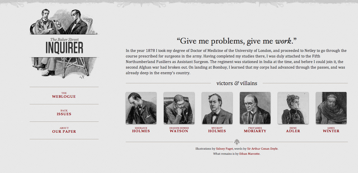
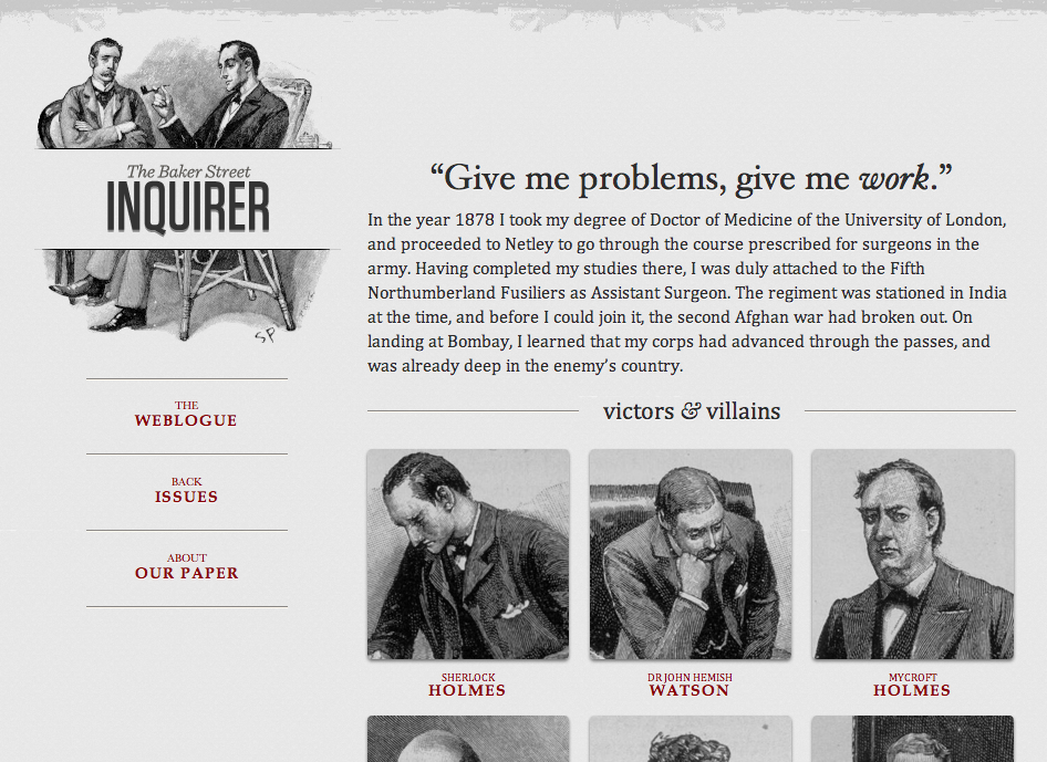
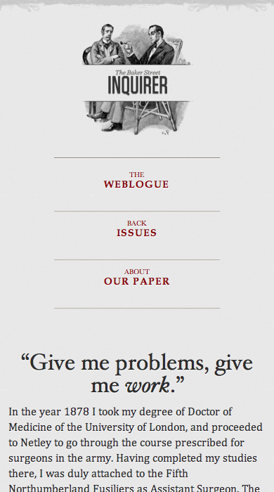
Introdution to
WebBlocks
by Eric Bollens
ebollens [GitHub] / ebollens [LinkedIn] / @ericbollens [Twitter]
An Evolving Web
A Growing Audience
First we had desktop browsers
then we had mobile browsers
and now we have tablets and more
How do we deliver to every platform?
Approaching Mobile
Native apps
iOS SDK, Android SDK, etc.
Mobile web apps
jQuery Mobile, Sencha Touch, MWF, etc.
Hybrid apps
PhoneGap, Appcelerator, etc.
Are these the right approach?
Do we need a separate experience for mobile?
How do we tackle tablets and other devices?
How about a single site to handle all?
Responsive Web Design
What is Responsive Web Design?
Website transforms to fit the user's
needs
and capabilities
Viewport
Context
Bandwidth
Pixel Density
Battery Life
And many more...
Three Components
Flexible grid
Responsive media
Media queries
 |
 |
 |
 |
 |
 |
Benefits of Responsive Design
- Save time and money
- Stay relevant to all viewers
- Don't guess at what the user wants
- Provide a consistent experience
- Future proof
Handrolling Responsive
Difficult problems to solve
Layouts
Images
Navigation
Tables
Existing frameworks, components, and libraries
solve these problems
Framework Paralysis
25+ responsive grid systems
20+ responsive image solutions
20+ responsive navigation patterns
7+ responsive table solutions
5+ responsive frameworks
We don't need to start from scratch
We need to integrate
WebBlocks Responsive Toolkit
Where do we start?
There's a ton of good work already out there...
|
|
|
Extend, don't recreate
Define a clear, standards-based set of semantics
Take advantage of existing tools where viable
Build additional functionality as needed
Features
|
Responsive Design |
|
|
Support Libraries |
|
|
Rich Interfaces |
|
Getting Started with WebBlocks
Getting WebBlocks
Download a WebBlocks release build
Compile WebBlocks from source
Additional methods coming soon
Online build tool
Hosted version
Setting up the Page
<!DOCTYPE html>
<html lang="en">
    <head>
        <title><!-- title --></title>
        <meta http-equiv="Content-Type" content="text/html; charset=UTF-8">
        <link rel="stylesheet" href="css/blocks.css">
        <script type="text/javascript" src="js/blocks.js"></script>
        <!--[if lte IE 9]>
        <link rel="stylesheet" href="css/blocks-ie.css">
        <script type="text/javascript" src="js/blocks-ie.js"></script>
        <![endif]-->
        <meta name="viewport" content="width=device-width, initial-scale=1">
    </head>
    <body>
        <!-- ... -->
    </body>
</html>
Container
Controls content area width and gutters
<div class="container">
    <!-- contents -->
</div>
Most elements should be placed in a container
excluding navbars and other full-page elements
Grid System
A row composed of panels
<div class="row">
    <div class="panel-3"><!-- ~25% --></div>
    <div class="panel-7"><!-- ~58.3% --></div>
    <div class="panel-2"><!-- ~16.7% --></div>
</div>
<div class="row right">
    <div class="panel-2"><!-- ~16.7% --></div>
    <div class="panel-10"><!-- ~83.3% --></div>
</div>
panel-X between 1 and 12 with a % width ~ X/12
Use the right class on row for right-to-left
Always collapses in markup order
Rows may be nested
Laying out a Page
Two-column
<div class="row">
    <nav class="panel-3"><!-- left-side navigation --></nav>
    <main class="panel-9"><!-- main content --></main>
</div>
<div class="row right">
<nav class="panel-3"><!-- right-side navigation --></nav>
<main class="panel-9"><!-- main content --></main>
</div><div class="row">
<main class="panel-9"><!-- main content --></main>
<aside class="panel-3"><!-- right-side support --></aside>
</div>Laying out a Page
Three-column
<div class="row">
    <nav class="panel-3"><!-- left-side navigation --></nav>
    <main class="panel-6"><!-- main content --></main>
    <aside class="panel-3"><!-- right-side support --></aside>
</div>
<div class="row">
<nav class="panel-3"><!-- left-side navigation --></nav>
<div class="panel-9">
<div class="row right">
<nav class="panel-4"><!-- right-side navigation --></nav>
<main class="panel-8"><!-- main content --></main>
</div>
</div>
</div>Grid System Breakpoints
Seven breakpoints available
| xxsmall | 360px | medium | 960px | |
| xsmall | 480px | medium-large | 1024px | |
| small | 640px | large | 1200px | |
| medium-small | 768px |
Use Y-collapse on row for breakpoint Y
<div class="row medium-collapse">
    <div class="panel-6"><!-- ~50% --></div>
    <div class="panel-6"><!-- ~50% --></div>
</div>
Flexible Content Arrangement
<div class="row medium-collapse">
    <div class="panel-6">
        <div class="row small-collapse">
            <div class="panel-6"><!-- item 1 --></div>
            <div class="panel-6"><!-- item 2 --></div>
        </div>
    </div>
    <div class="panel-6">
        <div class="row small-collapse">
            <div class="panel-6"><!-- item 3 --></div>
            <div class="panel-6"><!-- item 4 --></div>
        </div>
    </div>
4 columns above medium breakpoint
2 rows of 2 columns between medium and small breakpoint
4 full-width items below small breakpoint
Visibility, Floats and Alignment
|
|
||||||||||||||||||||
|
|
||||||||||||||||||||
|
|
Mixing & Matching Breakpoints
<section class="row medium-collapse">
    <div class="panel-4">
        <div class="row xsmall-collapse">
            <div class="panel-4 text-center-xsmall hide-xxsmall">
                <img src="img/articles/1.jpg" class="constrained">
            </div>
            <div class="panel-8">
                <h1 class="text-center-xsmall"><!-- article title -->
                    <br><small><!-- tagline --></small></h1>
                <p class="hide-medium-small"><!-- description --></p>
                <p class="text-center-xsmall text-right-above-xsmall">
                    <a href="article/1"><!-- read more prompt --></a></p>
            </div>
        </div>
    </div>
    <!-- and two more... -->
</section>
Content Cluster
<div class="cluster">
    <div><!-- 1 --></div>
    <div><!-- 2 --></div>
    <div><!-- 3 --></div>
    <div><!-- 4 --></div>
    <div><!-- 5 --></div>
    <div><!-- 6 --></div>
</div>
<div class="left cluster">
<div><!-- 1 --></div>
<div><!-- 2 --></div>
<div><!-- 3 --></div>
<div><!-- 4 --></div>
<div><!-- 5 --></div>
</div>Color System
Branding colors
primary, secondary, tertiary, neutral
Mood colors
info, success, warning, error, danger, important, inverse, required, highlight
Variation modifiers
gradient, light, dark, emphasize, fade
Text colors
Prepend "text-" to a branding or mood color
<div class="primary gradient light text-tertiary">Buttons, Badges and Messages
<a href="path/to/link" class="button"><!-- button text --></a>
<input type="submit" href="path/to/link" class="button success">
<button class="button primary light"><!-- button text --></button>
<span class="badge warning"><!-- badge text --></span>
<span class="badge danger square"><!-- badge text --></span>
<span class="badge secondary round light gradient"><!-- badge text --></span>
<div class="message"><!-- message text --></div>
<div class="message primary"><!-- message text --></div>
<div class="message danger gradient emphasize"><!-- message text --></div>Forms
<form action="to/action" method="post" class="form horizontal">
    <div class="control">
        <label for="input"><!-- label text --></label>
        <input id="input">
    </div>
    <div class="control secondary">
        <label for="text"><!-- label text --></label>
        <textarea id="text" class="large" aria-describedby="text-desc"></textarea>
        <p id="text-desc"><!-- help text --></p>
    </div>
    <div class="control">
        <label id="checkset"><!-- label text --></label>
        <div class="inline">
            <label><input type="checkbox" aria-labelledby="checkset"> first</label>
            <label><input type="checkbox" aria-labelledby="checkset"> second</label>
        </div>
    </div>
    <div class="control"><input type="submit" class="button"></div>
</form>
Navigation List
<nav class="list">
    <ul>
        <li><a>Item 1</a></li>
        <li><a>Item 2</a></li>
        <li><a>Item 3</a></li>
    </ul>
</nav>
<nav class="list">
<h1>List Header</h1>
<ul>
<li><a>Item 1</a></li>
<li><h2>Item 2</h2>
<ul>
<li><a>Item 2 Sub 1</a></li>
<li><a>Item 2 Sub 2</a></li>
</ul>
<ul class="divider">
<li><a>Item 2 Sub 3</a></li>
<li><a>Item 2 Sub 4</a></li>
</ul>
</li>
<li><a>Item 3</a></li>
</ul>
</nav>plus accordion and flyout effects
Navigation Bar
Bar collapsing to dropdown when it overflows
<nav class="bar">
    <ul>
        <li><a>Item 1</a></li>
        <li><a>Item 2</a></li>
        <li><a>Item 3</a></li>
    </ul>
</nav>
<nav class="bar primary">
<!-- list of menu items -->
</nav><nav class="bar secondary light top">
<!-- list of menu items -->
</nav><nav class="bar tertiary dark bottom">
<!-- list of menu items -->
</nav>Navigation Breadcrumb
<nav class="breadcrumb">
    <ul>
        <li><a>Item 1</a></li>
        <li><a>Item 2</a></li>
        <li><a>Item 3</a></li>
    </ul>
</nav>
<nav class="breadcrumb">
<ul>
<li><a>Item 1</a> <span class="divider">/</span></li>
<li><a>Item 2</a> <span class="divider">/</span></li>
<li><a>Item 3</a> <span class="divider">/</span></li>
</ul>
</nav>Utilities
Tables
<table class="table scrollable-collapse">
    <!-- ... -->
</table>
Also: bordered, striped, hover, condensed and caption support
Lists
<ul class="list unstyled horizontal">
    <!-- ... -->
</ul>
Also: numbered list types and outline list
Utilities
Images
<img src="example.png" class="constrained">Blockquotes
<blockquote class="blockquote">
    <!-- Blockquote Text -->
</blockquote>
<figure class="blockquote">
<blockquote>
<!-- Blockquote Text -->
</blockquote>
<figcaption>
<!-- Blockquote Attribution -->
</figcaption>
</figure>Markup-driven Effects
<button data-target="element">Trigger</button>
<div id="element" data-effect="toggle" data-toggle="hide">Target</div>
<div data-effect="accordion" data-accordion="slide">
<div data-target="element1">Trigger 1</div>
<div id="element1">Target 1</div>
<div data-target="element2">Trigger 2</div>
<div id="element2">Target 2</div>
</div><div data-target="element1">Trigger 1</div>
<div data-target="element2">Trigger 2</div>
<div data-effect="tabs">
<div id="element1">Target 1</div>
<div id="element2">Target 2</div>
</div>Client-side Images
<span data-picture data-alt="Example image">
    <span data-src="small.jpg"></span>
    <span data-src="small-hi.jpg" data-media="(min-resolution: 300dpi)"></span>
    <span data-src="medium.jpg" data-media="(min-width: 321px)"></span>
    <span data-src="medium-hi.jpg"
          data-media="(min-width: 321px) and (min-resolution: 300dpi)"></span>
    <span data-src="large.jpg" data-media="(min-width: 961px)"></span>
    <span data-src="large-hi.jpg"
          data-media="(min-width: 961px) and (min-resolution: 300dpi)"></span>
    <noscript><img src="large.jpg" alt="Example image"></noscript>
</span>
<img src="small.jpg" srcset="small.jpg 320w,
small-hi.jpg 320w 2x,
medium.jpg 960w,
medium-hi.jpg 960w 2x,
large.jpg 1600w,
large-hi.jpg 1600w 2x">Server-side Images
Adaptive Images
Client Hints
dh=598, dw=384, dpr=2.0Adaptive Images with Client Hints
And a lot more
Beyond Semantics
WebBlocks is a Toolkit
Pick and choose among supported packages
Select modules of semantic elements
Add branding and other extensions
Configure build variables and settings
Add your own custom sources
And compile!
How does this work?
CSS is compiled with SASS, Compass and modular pipeline
Javascript and images are optimized and assembled
Once compiled, WebBlocks assets are static
No server-side logic needed
Just CSS, Javascript and images
Cutting down the complexity
When all this flexibility isn't needed...
Point your CSS and Javascript at a hosted version
or download and deploy directly in your app
And when it is...
Use the online build tools
or configure and run the compiler
or integrate it into an existing build process
Extending WebBlocks
Customize Your Build
Set colors, breakpoints and more through SASS variables
WebBlocks includes over 200 configurable variables
$color-branding-primary: #2288bb;
$color-branding-secondary: #ffb300;
$color-branding-tertiary: #8237ff;
$color-mood-info: #00a5e5;
$color-mood-success: #00ff87;
$color-mood-warning: #ffe800;
$color-mood-danger: #b73434;
$color-mood-error: #b73434;
$color-mood-required: #b73434;
$color-mood-important: #ff00a5;
$color-mood-highlight: #ff00a5;
$color-mood-error: #a00;
$color-mood-danger: #a00;Modularize with Extensions
Package up variables and custom CSS
Good for branding and feature extending
WebBlocks.config[:src][:extensions] << 'ucla'Extensions can be mixed and matched
WebBlocks.config[:src][:extensions] << 'ucla'
WebBlocks.config[:src][:extensions] << 'flat-ui'
Extensions for Federation
WebBlocks.config[:src][:extensions] << 'ucla'
WebBlocks.config[:src][:extensions] << 'ucla-oit'
http://ucla.github.io/WebBlocks/doc/#Configuration/Compiler/Components
http://ucla.github.io/WebBlocks/doc/#Recipe/Integration/Fork
App-specific Sources
When extensions aren't enough, add app-specific sources
override SASS variables
add and override CSS definitions
add Javascript, images and other assets
http://ucla.github.io/WebBlocks/doc/#Recipe/Integration/Use
And you can integrate the compiler into your build process
http://ucla.github.io/WebBlocks/doc/#Recipe/Integration/Submodule
Reducing Switching Costs
Switching frameworks can be an expensive ordeal
Adapters bind WebBlocks with another framework
Zero switching costs for supported frameworks
WebBlocks.config[:src][:adapter] = 'bootstrap'http://ucla.github.io/WebBlocks/doc/#Configuration/Compiler/Components
http://ucla.github.io/WebBlocks/doc/#Core/Architecture/Adapter
Leveraging Modularity
An extensive framework means a large footprint
All semantic elements are broken down into modules
Define a build with only specific modules
WebBlocks.config[:src][:modules] = []
WebBlocks.config[:src][:modules] << 'base'
WebBlocks.config[:src][:modules] << 'compatibility'
WebBlocks.config[:src][:modules] << 'entity/button'
WebBlocks.config[:src][:modules] << 'entity/form'
WebBlocks.config[:src][:modules] << 'entity/message'
http://ucla.github.io/WebBlocks/doc/#API/Modules
http://ucla.github.io/WebBlocks/doc/#Configuration/Compiler/Components
http://ucla.github.io/WebBlocks/doc/#Core/Architecture/Module
Where Are We Now?
WebBlocks 1
WebBlocks 1.0 released June 21, 2013
WebBlocks 1.1 released December 31, 2013
Download and build from sources:
https://github.com/ucla/WebBlocks
Or pull a compiled version:
https://github.com/ucla/WebBlocks/releases
WebBlocks Build Server
Tool for remotely building custom jobs
such as from the documentation's builder GUI
Available for download:
https://github.com/ucla/WebBlocks-build-server
Plans to provide a build server service
WebBlocks CMS Integrations
Integration pattern
Theme with integrated WebBlocks build process
Configuration plugin that calls out to build server
Views / content types using WebBlocks semantics
First integrated theme in Drupal
Comprehensive connector for Plone in progress
Model can be applied to any app that follows this pattern
WebBlocks 2
WebBlocks 1 has grown organically
WebBlocks 2 will build on lessons learned
Overhaul of modular architecture
WebBlocks 2
Goals...
Remove confusion between modular types
Reduce barriers to entry
Trend towards microframeworks
Simplify adding third-party packages
Explicit control rather than implicit convention
Substantial compiler performance improvements
Backwards compatible for end users
although some work for advanced users
Slated for Summer
Collaboration
Repository
https://github.com/ucla/WebBlocks (v1.x)
https://github.com/WebBlocks/WebBlocks (v2)
Documentation
http://ucla.github.io/WebBlocks/doc
Live Support
ihttps://gitter.im/WebBlocks/WebBlocks
Mailing List
http://lists.ucla.edu/cgi-bin/mailman/listinfo/webblocks
THANK YOU
Any Questions?
ebollens.github.io/WebBlocks-presentations/introduction
ebollens [GitHub] / ebollens [LinkedIn] / @ericbollens [Twitter]