Introduction to
Responsive Design
The Web is Flexible
The control which designers know in the print medium... is simply a function of the limitation of the printed page.
We should embrace the fact that the web doesn't have the same constraints, and design for this flexibility.
~ John Allsopp, A Dao of Web Design
Why Do We Care?
First, there was the desktop
- What size do we target?
- How about percentage-based designs?
Then there was mobile
- Different browsing experience, different app
- Strategies like MVC and SOA redundancy
But is that enough anymore?
The Changing Demographic
Tablets are somewhere in the middle
- Do we treat them as mobile or desktop?
Mobile devices are used in many ways
- A different experience doesn't always make sense
It's time for a paradigm shift
Responsive Design
The ingredients:
- Flexible grid
- Flexible media
- Media queries
Ethan Marcotte in Responsive Web Design (2010)
Responsive Design
 |
 |
 |
Responsive Design
 |
 |
Benefits of Responsive Design
- Save money and time
- Stay relevant to all viewers
- Don't guess at what the user wants
- Provide a consistent experience
The Flexible Grid
Proportional design
- Percentages, not pixels
But what about those pretty Photoshop designs?
- target ÷ context = result
Works for widths, heights, fonts, margins, etc.
Example
A Fixed-Width Design
|
|
Example
Converting to Fluid Width
|
|
Example
What about Fonts?
|
|
Breaking the Flexible Grid
Flexible grid still has limits
 |
 |
 |
Flexible isn't flexible enough
Flexible grid can...
- constrict content on a small screen
- isolate content within whitespace on a large screen
Enter the media query
@media screen and (max-width: 479px){
    .ex {
        // ...
    }
}
Media Queries
Many detectable features available
@media (max-width: 479px){ }            @media (min-width: 480px){ }
@media (max-height: 479px){ }           @media (min-height: 480px){ }
@media (max-device-width: 479px){ }     @media (min-device-width: 480px){ }
@media (max-device-height: 479px){ }    @media (min-device-height: 480px){ }
@media (orientation: portrait){ }       @media (orientation: landscape){ }
@media (min-aspect-ratio: 16/9){ }      @media (max-aspect-ratio: 16/9){ }
@media (min-deviceaspect-ratio: 3/2){ } @media (device-aspect-ratio: 16/9){ }
@media (min-color: 8){ }                @media (max-color: 32){ }
@media (min-color-index: 256){ }        @media (max-color-index: 65536){ }
@media (min-resolution: 300dpi){ }      @media (max-resolution:299dpi){ }
@media (min-resolution: 300dpi){ }      @media (max-resolution:299dpi){ }
Chain multiple together with and keyword
@media (min-width: 480px) and (max-width:799px) { }Example
The "Broken" Flexible Grid
|
|
Example
Adding Media Queries to Flexible Grid
|
|
Responsive Media
Images have a fixed size
...so what happens when we go fluid?
 |
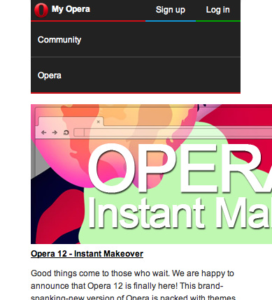 |
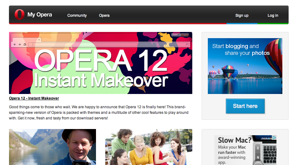
But that's not how Opera's site looks!
Responsive Media
What did they do?
img {
    max-width: 100%;
}
Richard Rutter in Images in liquid columns (2003)
Yep, that's it!
What about other media?
img, embed, object, video {
    max-width: 100%;
}
What About Performance?
Scaling looks bad in IE
#my-image{
    background: none;
    filter: progid:DXImageTransform.Micrisoft.AlphaImageLoader(
        src="/img/example.png", sizingMethod="scale");
}
But we're still wasting bytes...
- Media queries
- Anticipatory "polyfills"
- Dynamic image compression
Example
Media Queries
<img src="/img/small.jpg" alt="My Image" class="small">
<img src="/img/medium.jpg" alt="My Image" class="medium">
<img src="/img/large.jpg" alt="My Image" class="large">
@media screen and (min-width: 600px) {
.small, .medium { display: none; }
}
@media screen and (min-width: 440px) {
.small, .large { display: none; }
}
@media screen and (max-width: 439px) {
.medium, .large { display: none; }
}Example
Anticipatory "Polyfills"
<figure class="responsive" title="My Image"
        data-media440="/img/medium.png" data-media600="/img/large.png"
        data-media="/img/small.png">
    <noscript>
        <img src="/img/large.png" alt="My Image">
    </noscript>
</figure>
<picture alt="My Image">
<source src="/img/small.png">
<source src="/img/medium.png" media="(min-width:440px)">
<source src="/img/large.png" media="(min-width:600px)">
<noscript>
<img src="/img/large.png" alt="My Image">
</noscript>
</picture>Example
Dynamic Image Compression
MWF can do compression from a server farm
<img src="assets/min/img.php?img=http%3A%2F%2Fdomain%2Fimg%2Fexample.png">Adaptive Images uses .htaccess to compress transparently
Numerous other libraries out there as well
Mobile First
Not technically part of responsive design
but an effective strategy for building responsive sites
- Define your content linearly first
- As viewport widens, add complexity and asymmetry
- Use
min-width, notmax-width
Progressive enhancement, not graceful degradation
The Landscape Today
These techniques are supported by modern browsers, but...
- IE 8 and below don't support media queries Respond.js, CSS3-mediaqueries.js, Adapt.js, etc.
- Partial support in some browsers for psuedo-selectors Selectivizr
Responsive design is a viable choice today
... if not almost the obvious choice
And it is the future of MWF